Microsoft celebrates 15 years of OneDrive with a redesign and new features
OneDrive Home is rolling out in the 'coming months'
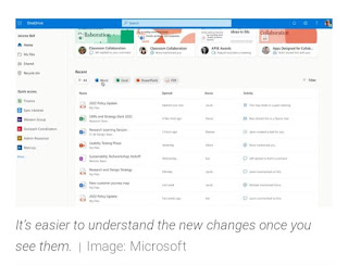
Microsoft's marking OneDrive's 15th anniversary with a new landing page, called OneDrive Home and it should make it easier to keep tabs on your work. Instead of arriving on the My files tab when you first open OneDrive, you'll find yourself on the new Home page that resembles that dashboard in the online version of Office.
Like the office web app, OneDrive Home contains a list of your files, organized by how recently you accessed them. The list of filters that let you sort your documents by Word, Excel, Powerpoint and PDF file types.
There's also a new "Activity" column to the right of the "Owner" file field that tells you when someone leaves a comment, @ mention other user or assigns you a task within a shared document. On the left side of the Home view, Microsoft's adding a new Quick access section, where you can find and pin your most frequently accessed spaces.
Unfortunately, theses changes aren't live right now - Microsoft says OneDrive Home will be available in "the coming months." From what it looks like, though, the new Home page could serve as a central hub that should help you stay organized while collaborating remotely.
Aside from its OneDrive web app, Microsoft is also rolling out photo story feature for the OneDrive mobile app (essentially OneDrive's equivalent to Instagram stories) to users in Australia. The feature's not reaching users in the US or other regions until later this year.


Post a Comment